EXHIBIT 4:Business Card

|
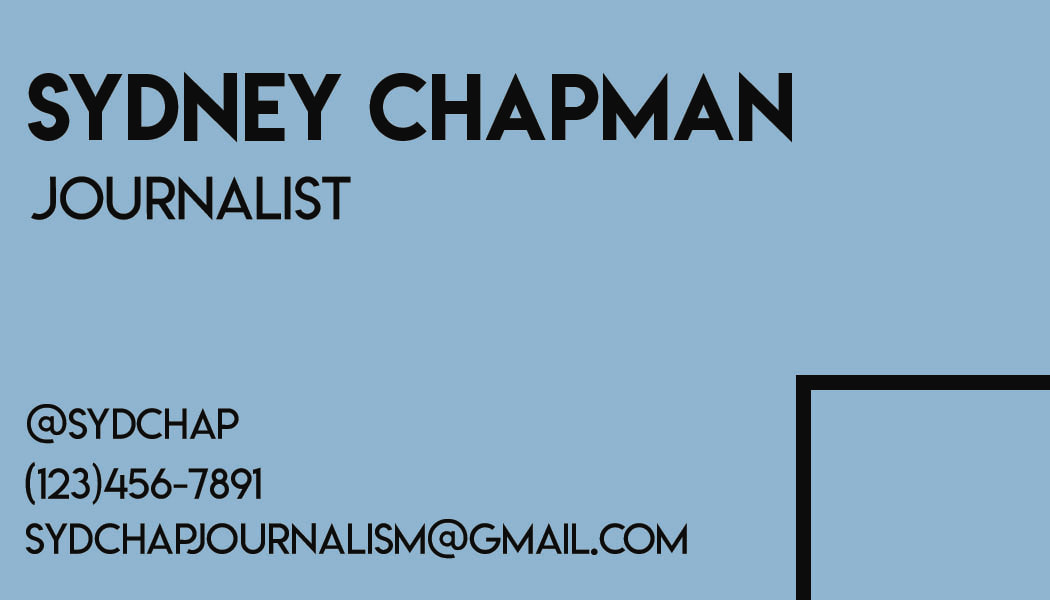
Contrast: For the contrast I used a black text on top of a light blue background.
Repetition: I used the black box on the front and back of the card. I also repeated the same font throughout the design.
Alignment: I chose a left-flushed alignment for the piece because it is a strong alignment which connects everything.
Proximity: I chose to group the name and title by placing them close together. I put all the contact info in a separate space so that it could be it's own group too.
Typography: For this card I only used two variations of the same font, Lemon milk and lemon milk light.
Photoshop: I opened two separate windows in photoshop, one for the front of the card and one for the back. Each canvas was 3.5x2 inches. I duplicated the background layer and used the rectangle tool to make a black background. On the front canvas, I used a pattern mask to give it a water-looking effect. Then, using the adjustment layers, I played with the hue and saturation until I got the color I wanted. To create the black squares I used the rectangle tool to make boxes and then made them to have no fill and increased the pixel amount on the outline to make it thicker. I used the text tool to type and place all of my text.
|
