Exhibit 2:
|
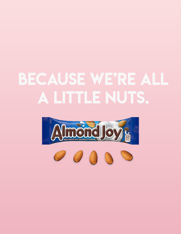
Almond Joy Ad
|
DESIGN
|
|
CONTRAST: For contrast in this advertisement I added some drop shadows to the almonds on the bottom. I also played with tints of red to make a pink which goes with the blue Almond Joy wrapper because blue and red are in a color triad together along with yellow. The yellow is sort of brought in with the tan of the almonds.
REPETITION: I repeated the white from the coconut by using white as my text color. I also have repetition with the almonds on the wrapper and placed at the bottom.
ALIGNMENT: For alignment I tried to play with flush left and flush right but I couldn't seem to break away from the center spacing on this design.
PROXIMITY: The text and candy bar are positioned near each other to get the message across.
TYPOGRAPHY: Since this is an advertisement that would probably go in a magazine, I elected to use a decorative and bold font to capture attention.
PHOTOSHOP: I opened up an 8.5 x 11 workspace in Photoshop. First I made the background layer by creating a rectangle and then using the fill tool to make it pink. I used the free transform tool to have it fit the whole space. Then I applied a gradient overlay to the shape. I then used my text tool to add the copy and placed the Almond Joy candy bar picture underneath. I brought in the picture of the almond and then hit the duplicate layer tool four times. I used the free transform tool to move and size each almond. Then using the effects menu I gave each of them a drop shadow.
|
