EXHIBIT 1:
|
USU STARS Motivational Display
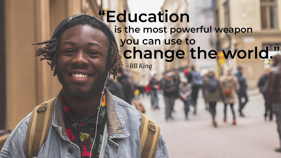
PHOTOSHOP: I opened up a new, 1920 x 1080 pixel file in photoshop. I went online and searched for a stock photo of a black student because I wanted students who are a minority in Utah to feel represented. Once I downloaded my photo, I moved it on top of my background layer and used the free transform tool to resize it. I had to play around a bit with the background image to have enough contrast to see the quote. First I worked on the saturation levels in Camera Raw. I toned down the blue, aqua and yellows. Then in photoshop, I used the blur tool to blur some of the buildings and background people. While this helped, I eventually elected to lighted the entire image. I then added four different text boxes for my quote and aligned them around the student's head. |
DESIGN
CONTRAST: In order to create contrast in this design, I made some of the words bolder and bigger in the quote.REPETITION: I repeated the size and boldness of the words in the quote I wanted to emphasize.ALIGNMENT: For the alignment, I shaped the quote around a line that follows the subject's head.PROXIMITY: The whole quote is in close proximity as is the attribution to the person who said it.TYPOGRAPHY: I used two different fonts in this motivational display, as was recommended by the book. They were Montserrat in bold face and Merriweather in italics. I originally tried to incorporate more of the Merriweather font but it didn't look right with the background and alignment I chose, so I stuck to just using it for the attribution.CREDITS: quote font— Montserrat,
|
