Exhibit 5
|
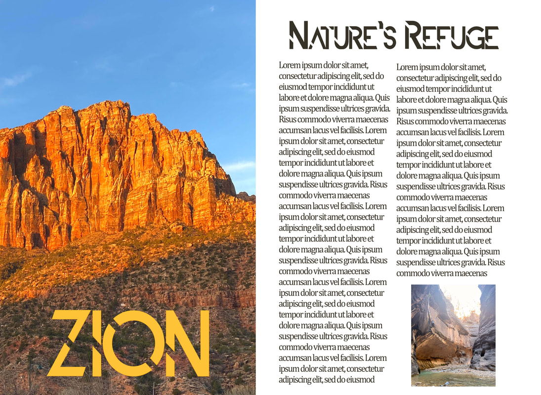
Description: For this magazine template spread I opened up a two page artboard in photoshop. Using the frame tool, I made a large photo placeholder for one big image on the left and a smaller one on the right. I then placed two photos from my recent trip to Zion in the frames and added the copy using the text tool. Since the national parks have recently been selling a lot of "retro" style merchandise, I wanted the font I used for the titles to be semi-reflective of that. I chose ALDITH because I seemed to give off a bit of a 90s vibe. Then for the body copy I chose a serif font, as is customary for articles. I used the color dropper tool to pick up the yellow color from the orange mountains and I used this color for the "ZION" title to tie things together.
|
