EXHIBIT 3:
Capstone Flyer
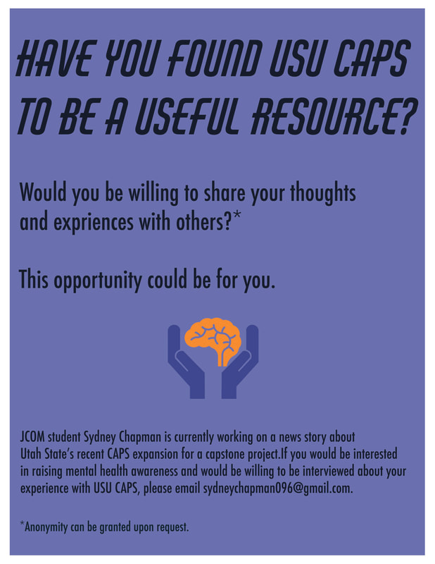
PHOTOSHOP: I opened up an 8.5x11 canvas in photoshop. I changed the color setting from RGB to CMYK since I intend to eventually print these out. I used the rectangle tool to make a blue field on my page then used the text tool to make all the copy and move it around. I then placed a clipart image of two hands holding up the mind in the empty space. I noticed that it didn't look the best with the blue colors I had chosen and used the effects menu to play with the hue and saturation of the flyer.
|
CONTRAST: I tried to create contrast with the two different fonts I used. Originally the background and text were more blue than purple and I worked with that to get the orange brain to be a complimentary color, they look more purplish now but I still think it stands out.
REPETITION: I went with an analogue color scheme for most of the flyer, only breaking away from it to have the orange brain. I also used repetition throughout the body copy.
ALIGNMENT: I chose a left flush alignment for this piece to connect everything.
PROXIMITY: I chose to group all of the questions and initial attention catching text together and then group the more in depth info down below for this piece. It seemed to go in a more natural order.
TYPOGRAPHY: I used a decorative font for the main headline and then a sans serif font for the rest of the copy. My purpose in doing this was to grab the student's attention and then make the rest of the flyer read easy.
|
